Project: Masterly Mobile app
Workflow
Research Interviews
Synthesis
Design
Usability Testing
Methodologies
Competitive Analysis
Survey
Interviews
Usability Testing
Preference Testing
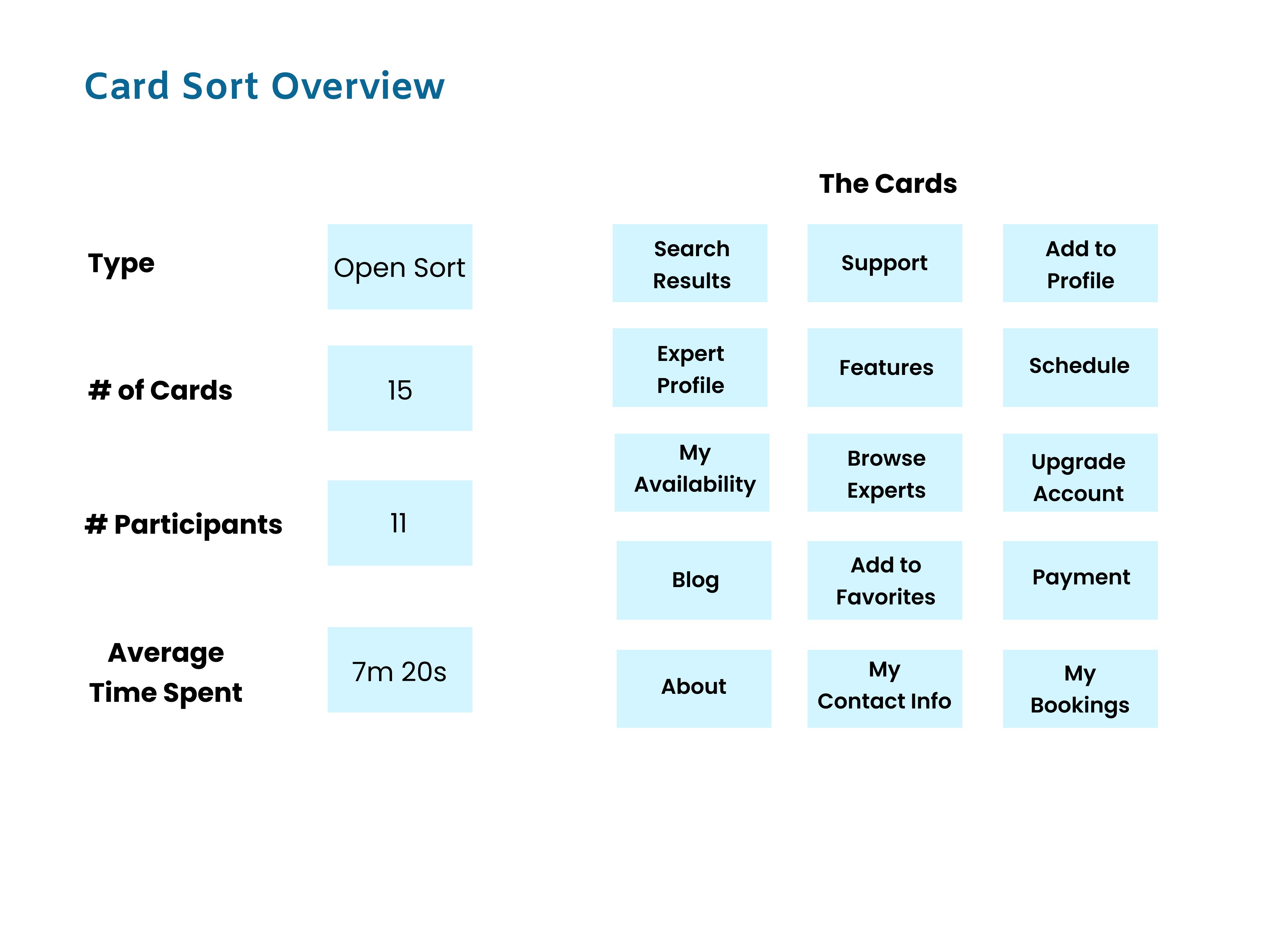
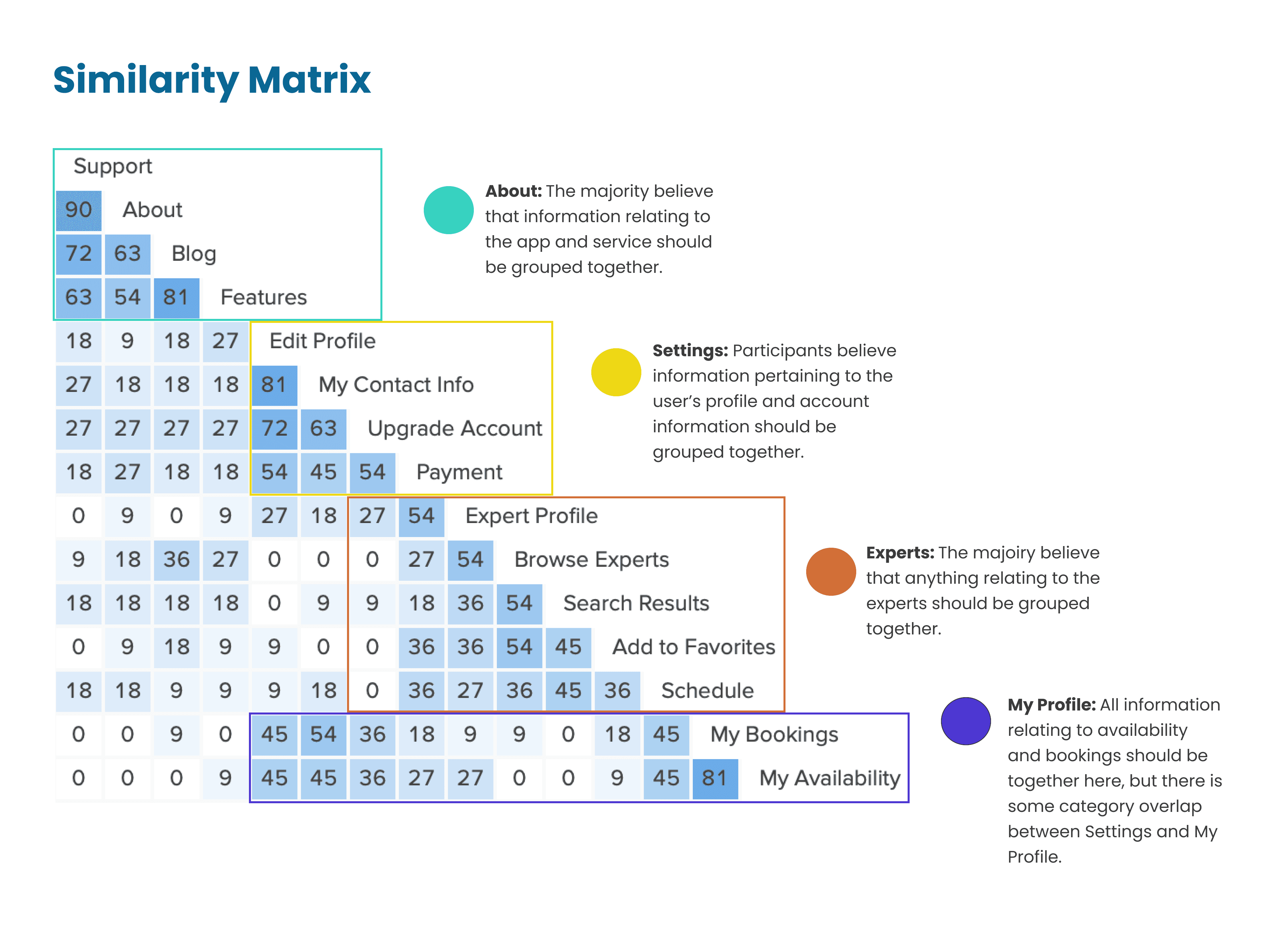
Affinity Mapping
Team
Lauren Chagaris
Tools
Figma
Balsamiq
Adobe Photoshop
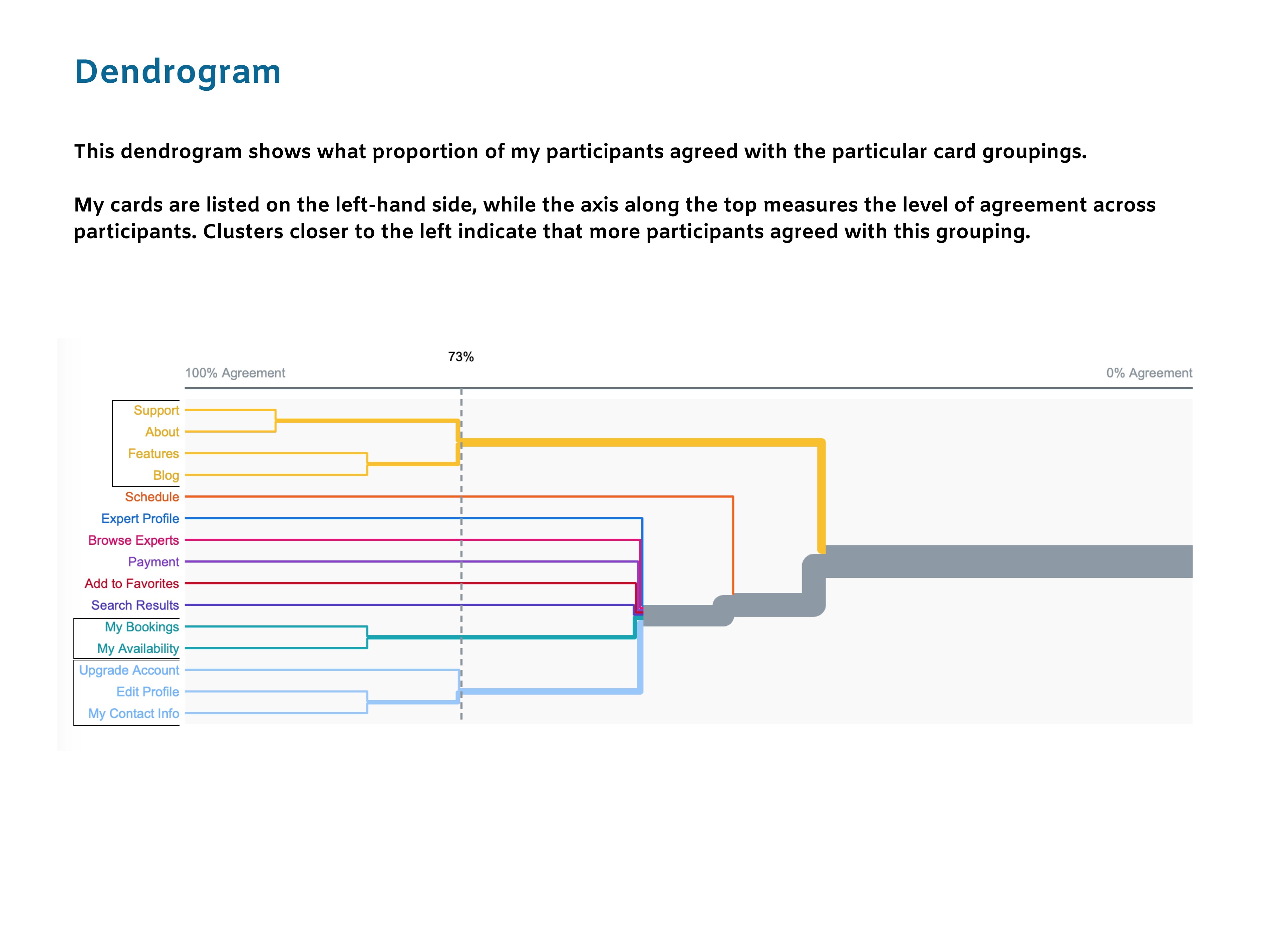
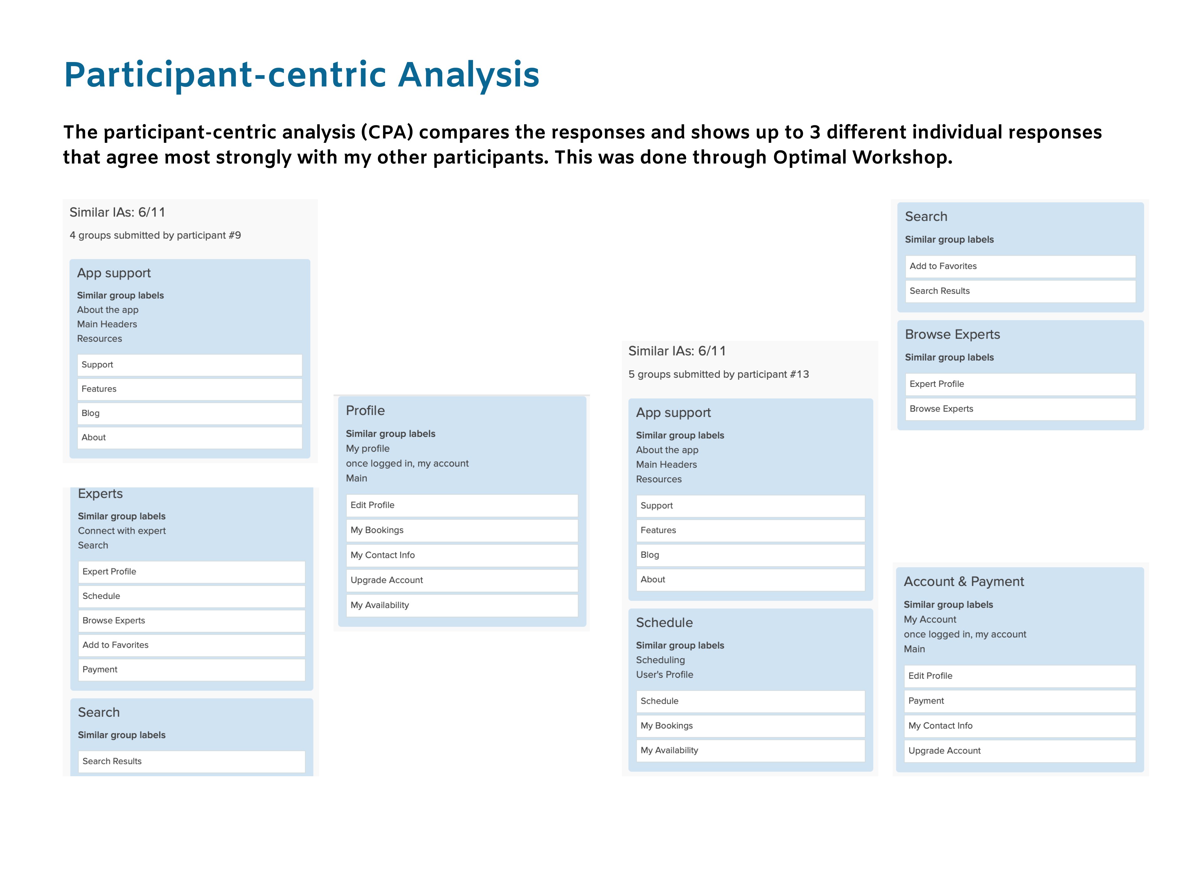
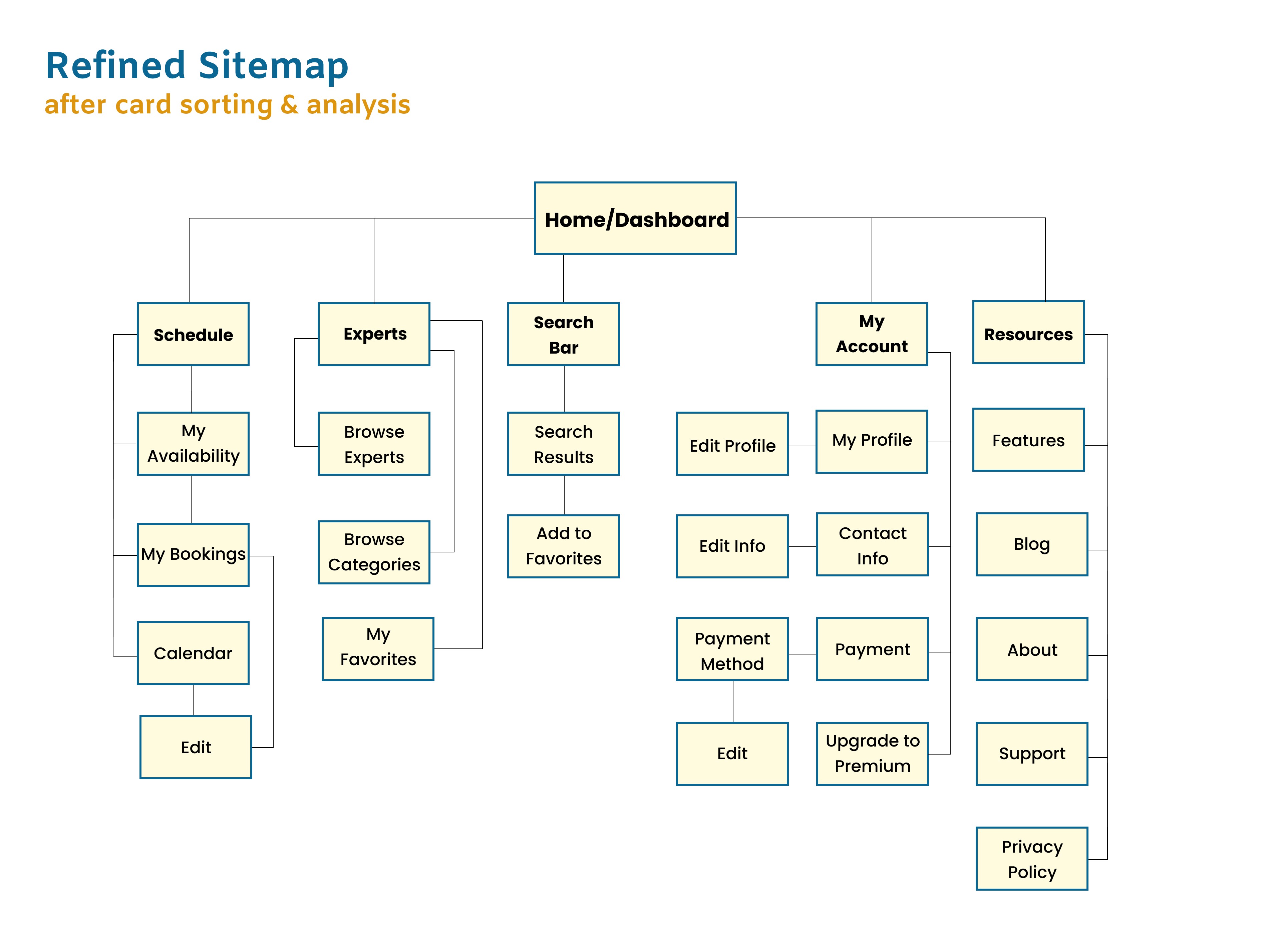
OptimalSort
Balsamiq
Zoom
Usability Hub
Slack
Pen & Paper

Project Brief
I designed Masterly as part of Careerfoundry’s UX Design Course.
In order to help people feel more knowledgeable and better equipped to handle their everyday personal and professional challenges, the team set out to develop an app that would allow users a simple, intuitive way to connect with an expert in almost any industry within seconds.
The Problem
The current economic downturn has driven people towards a self-sufficient mindset of completing tasks on their own, instead of hiring professionals to complete the work. Some people have specific learning styles that need attending to.
The Solution
Masterly allows users to quickly schedule a video chat meeting with a professional because they want to complete their task with full confidence. Whether it be a professional milestone, hobby, or complicated house project, people want to learn from real experts who can answer their questions in real time and cater to their individual needs and learning styles.
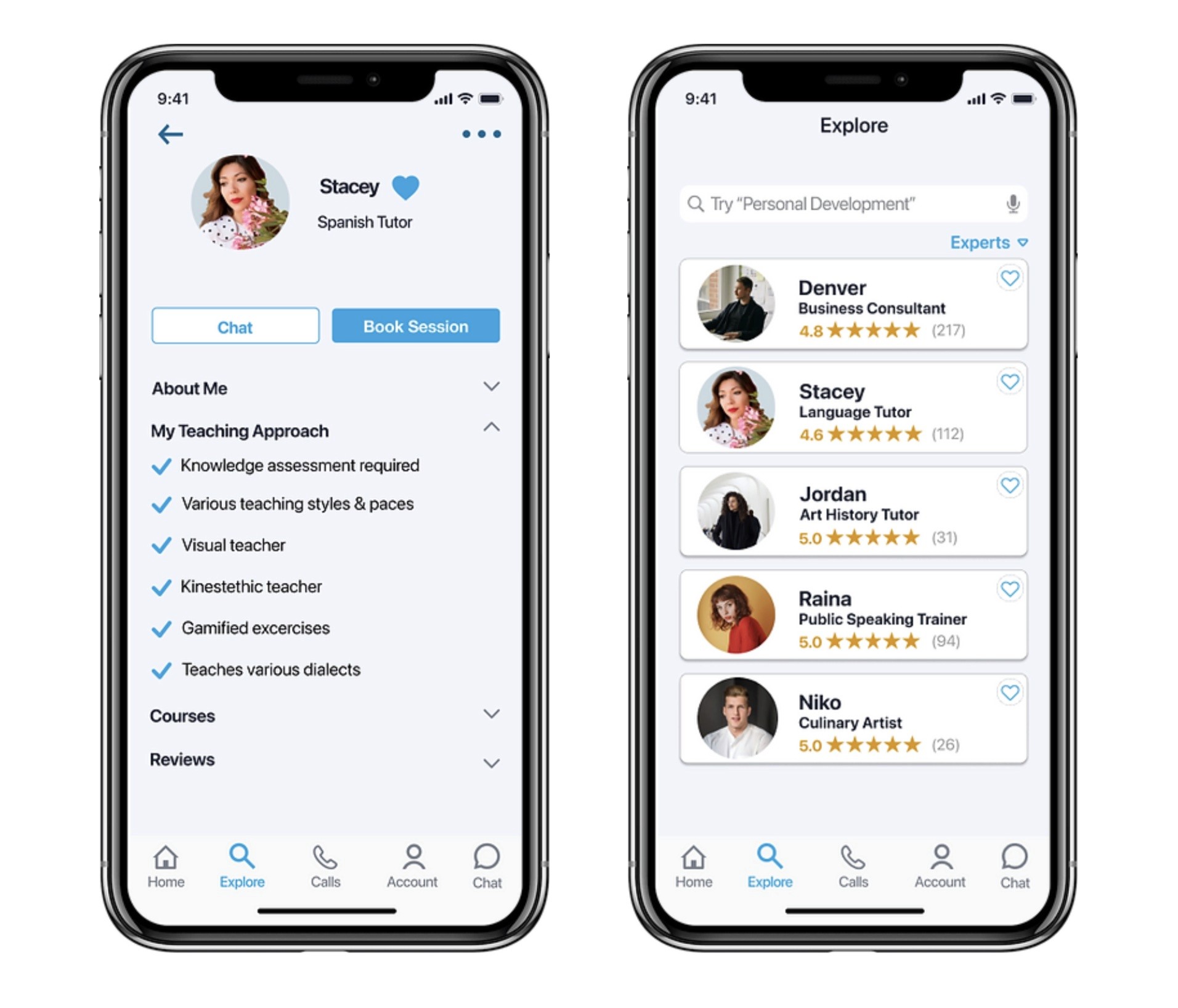
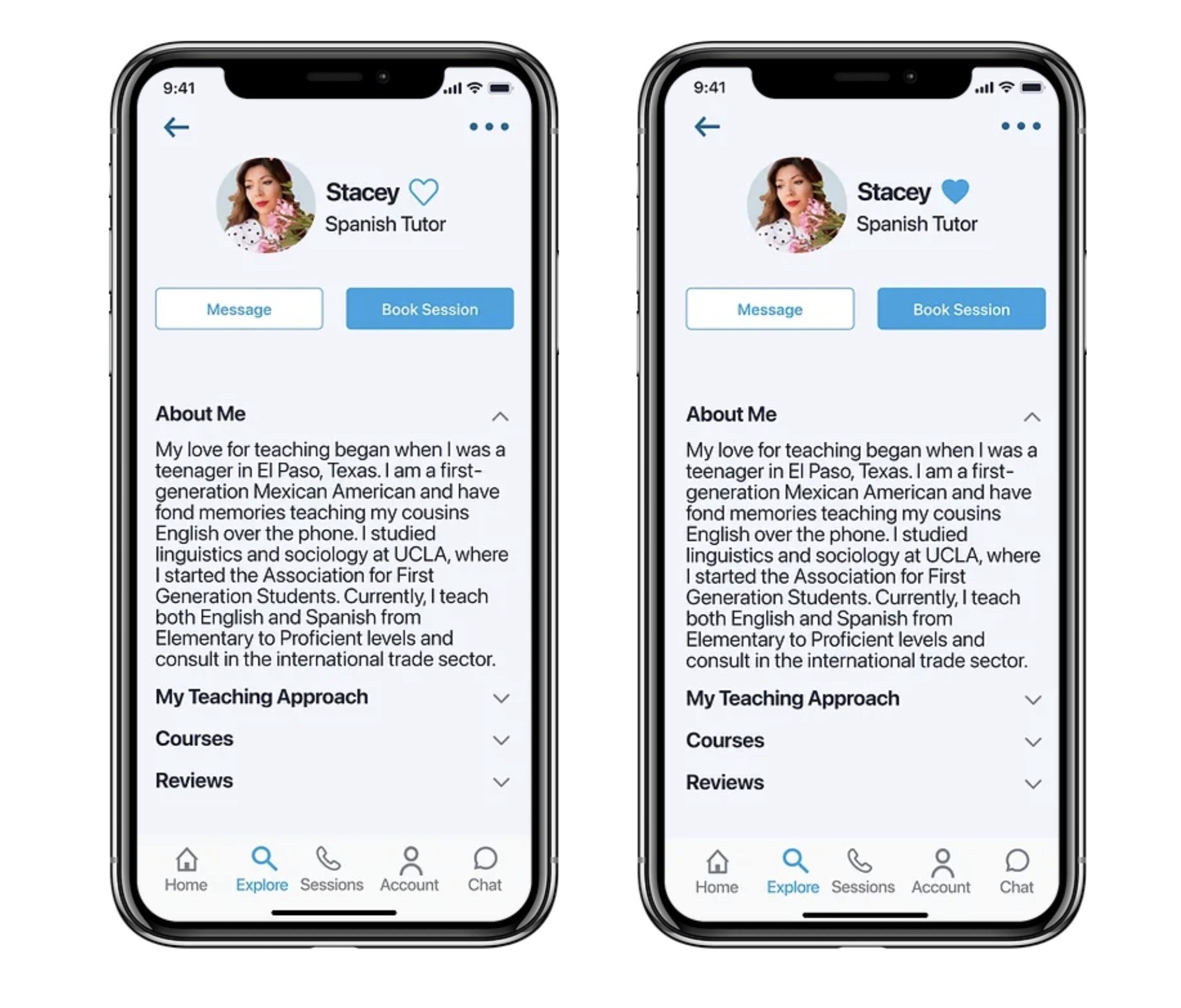
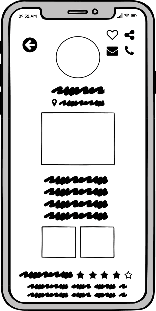
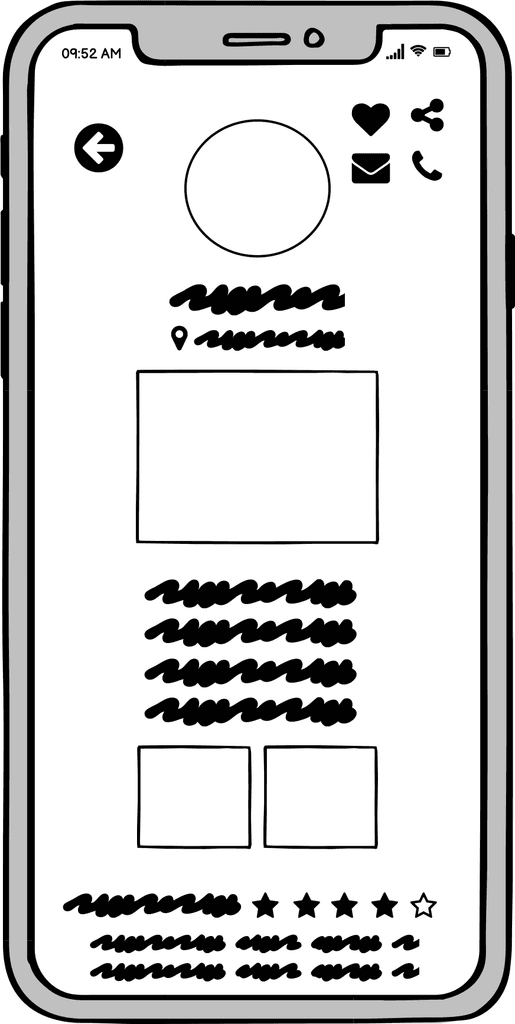
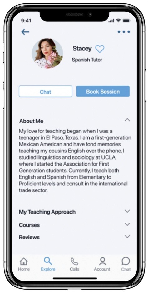
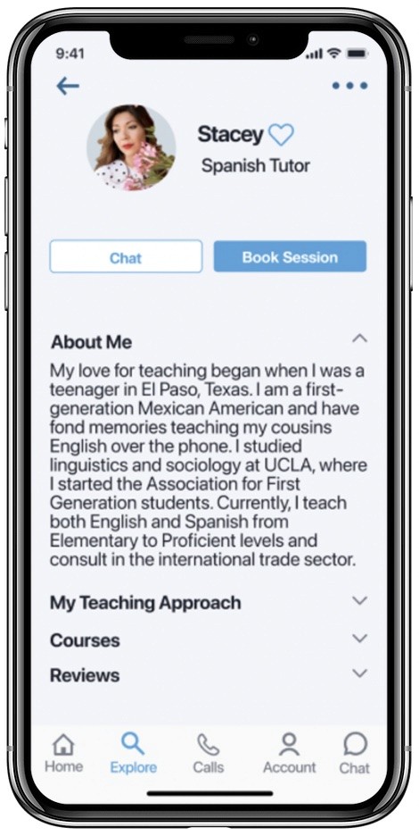
Find a Professional Expert or Tutor
Masterly is a community of vetted experts that will teach, guide, and mentor users towards their personal and professional goals.
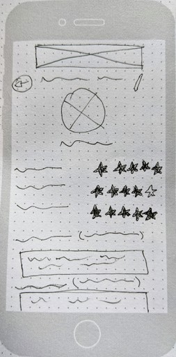
Favorite the Best
Users can keep track of the most impressive experts by favoriting them and compiling a list for quick access when needed.
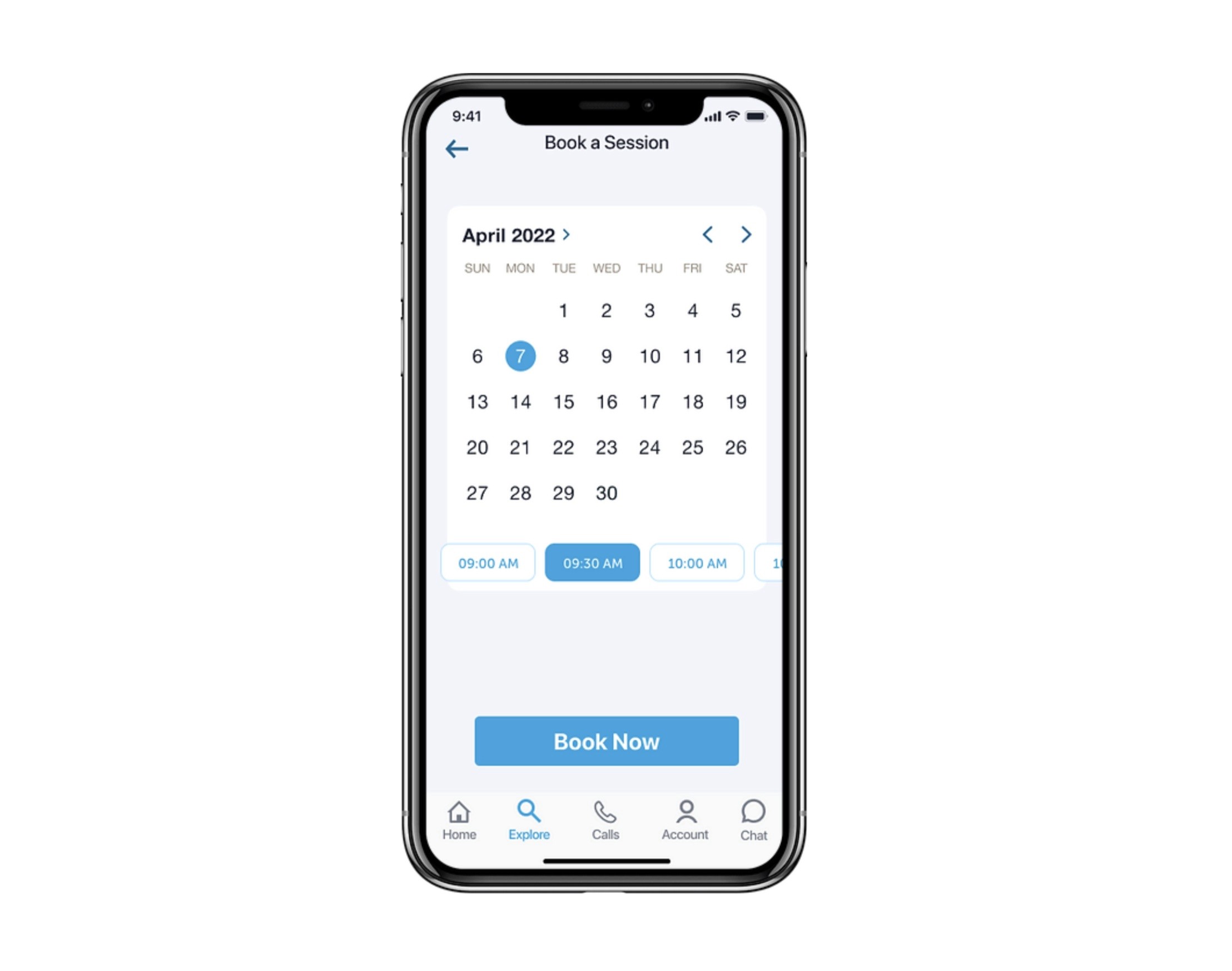
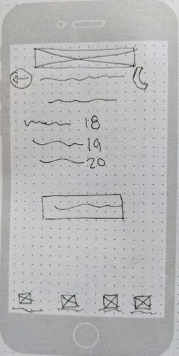
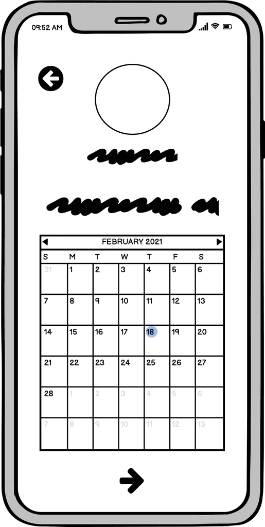
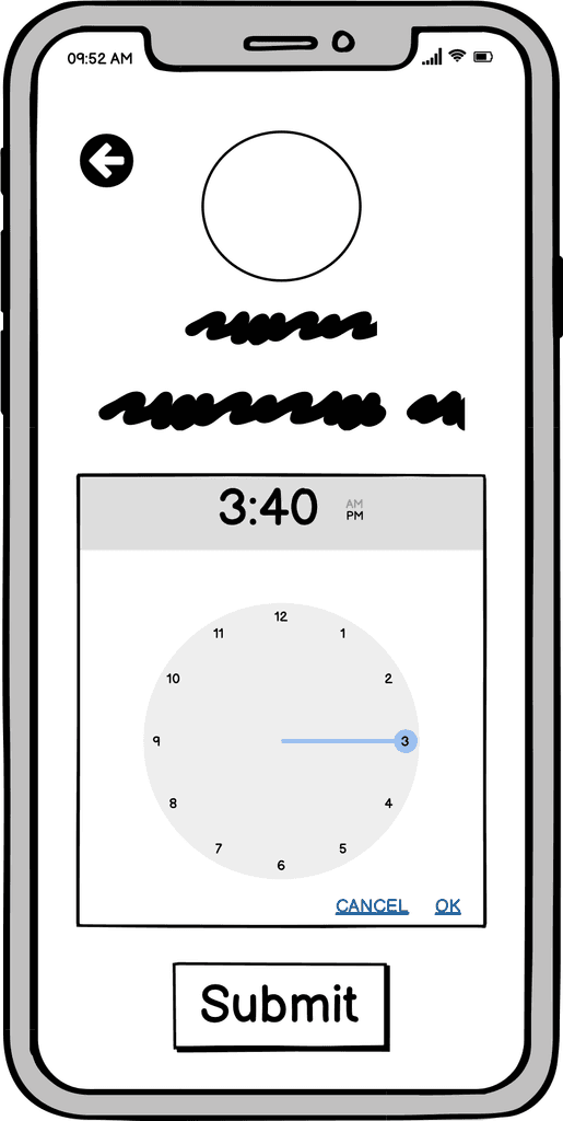
Book a Call
Our modern booking system makes it seamless to schedule sessions and syncs with Google Calendar. Never miss an appointment!
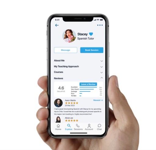
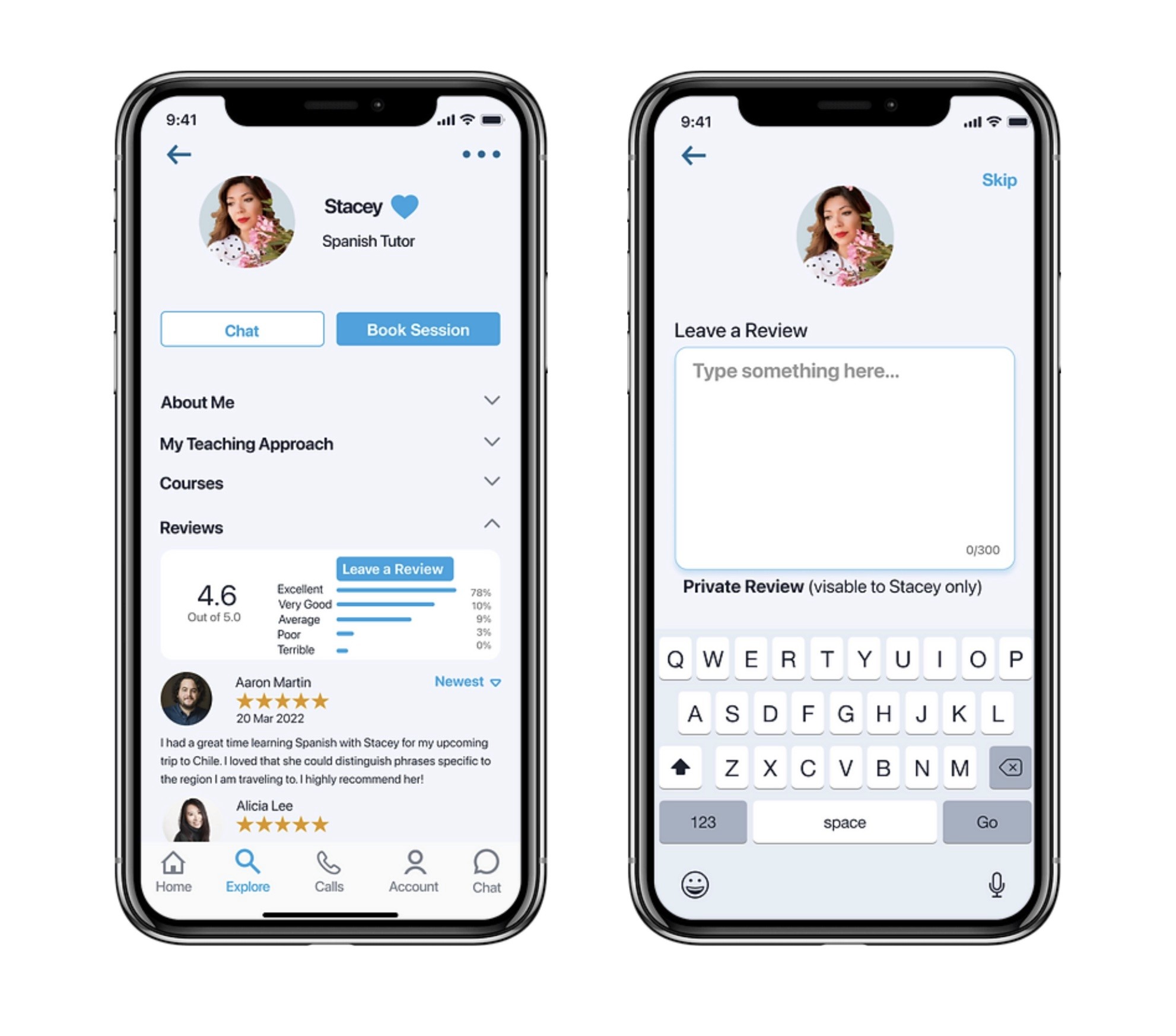
Rate & Review
Reading and leaving reviews is crucial in gaining client trust and building relationships.
User Interviews
Competitive Analysis
Understanding the Problem
Discovery
01
Approach - Design Thinking
A/B Preference Testing
Usability Testing
Wireframing
Prototyping
& Testing
03
Prototyping
Style Guide
Feedback
Problem Statement
"Our learners need a way to quickly schedule a video meeting with an expert in any field because they want guidance and advice on how to complete their tasks with full confidence."
SWOT Analysis
I then analyzed two competitor apps to identify undeserved opportunities in the market, spot weaknesses in their user experiences, and make better-informed decisions about Masterly's overall strategy. View the competitive SWOT Analysis.
User Interviews
I targeted twenty people who have used an online learning platform to participate in a survey. Four participants with the most interesting responses were recruited for an in-depth interview. They each had a medium to high level of awareness about online learning apps.
Research Goals
What factors motivate a person to choose a learning app and use it consistently?
Why choose to learn a skill live from a person versus reading or watching videos?
What are their pain points along the way when learning from a teacher?
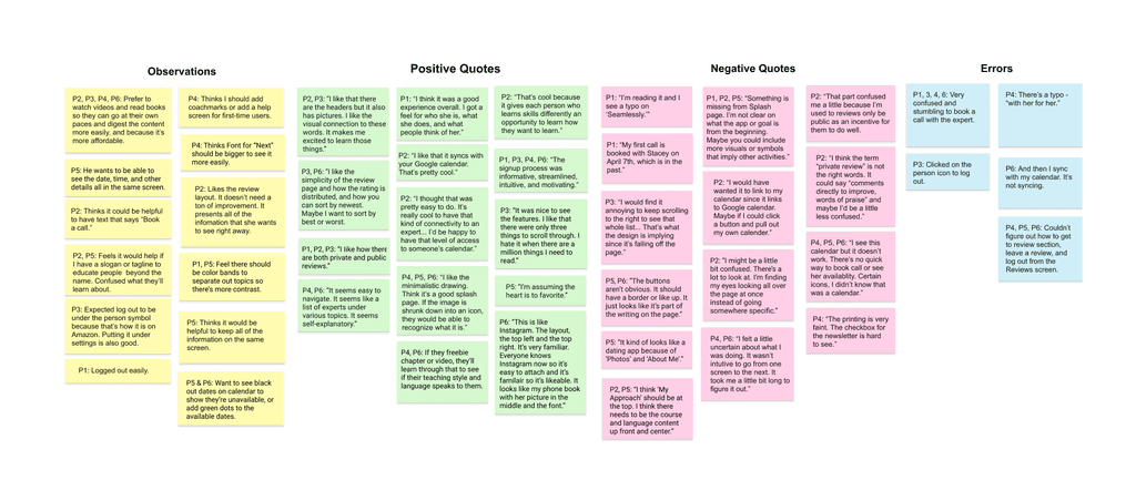
Key Findings
Students learn best when teachers utilize features like screen sharing.
Students struggle when the teaching style or content doesn’t match that particular student’s needs.
Students rely on the instructors for motivation.
Students stay engaged when the teacher simulates a classroom experience by encouraging group collaboration and projects.
Based on these findings, I decided to dive deeper into how Masterly can successfully cater to all types of people with various learning styles. I was also curious as to what types of follow-through tasks the experts can encourage, and how the experts can keep the students motivated to keep improving their skills in addition to staying loyal to the app.
View Full Research Report
02. Concepting
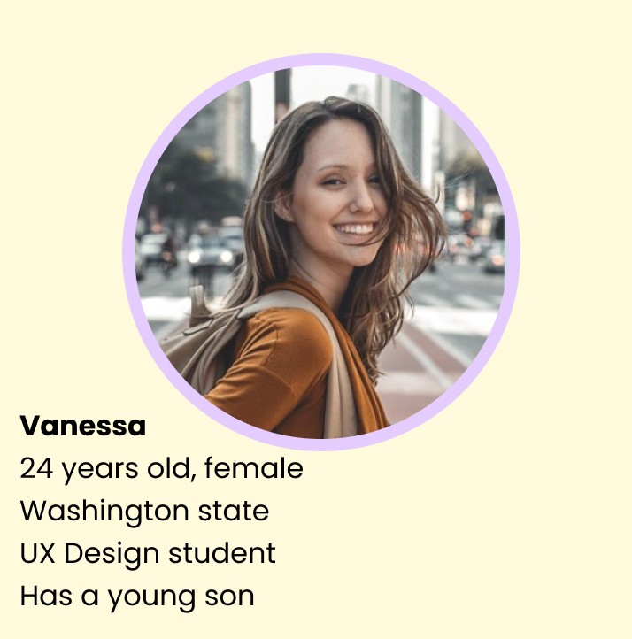
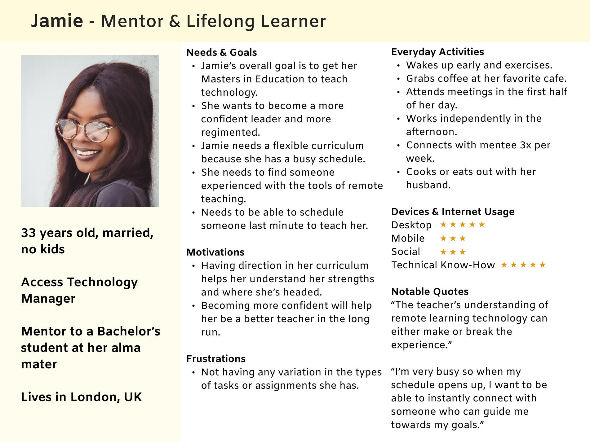
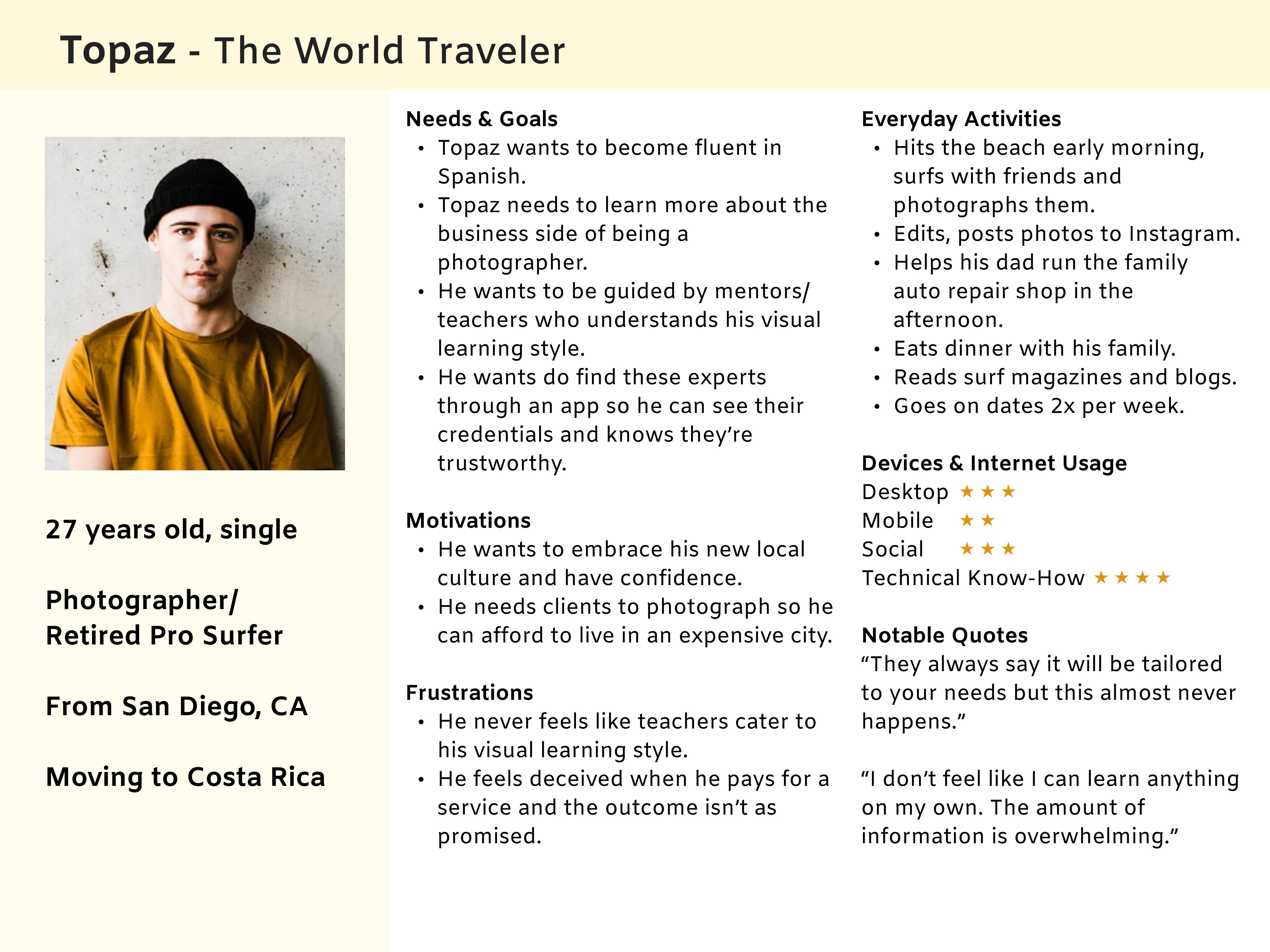
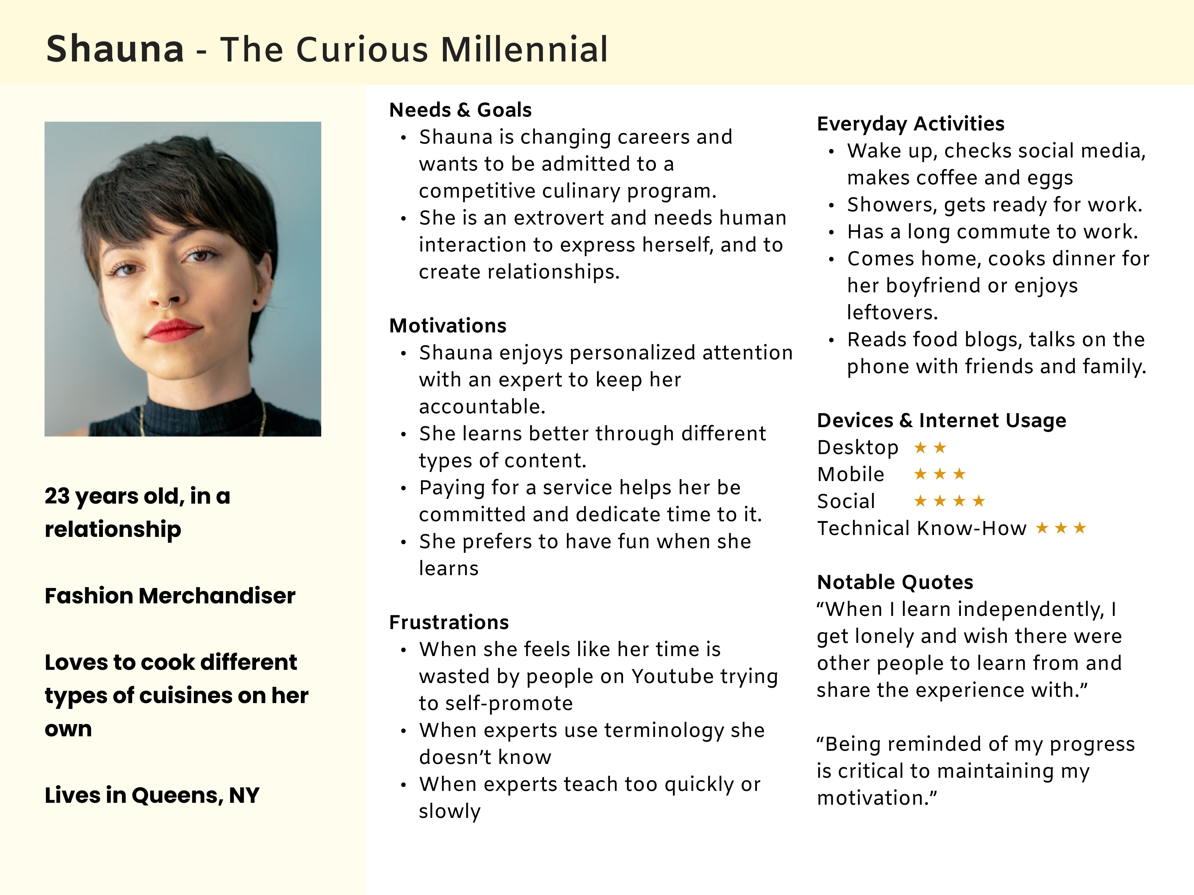
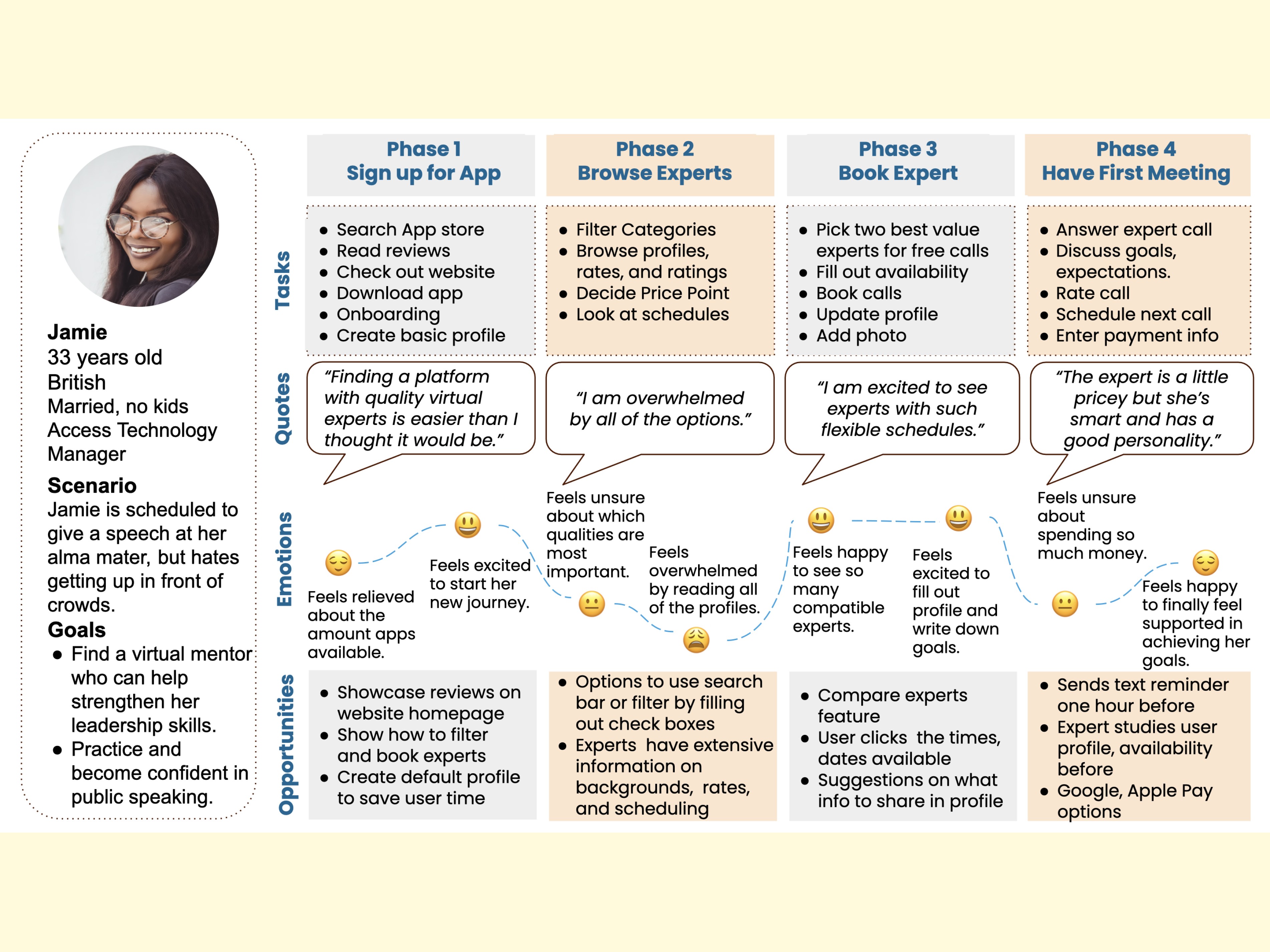
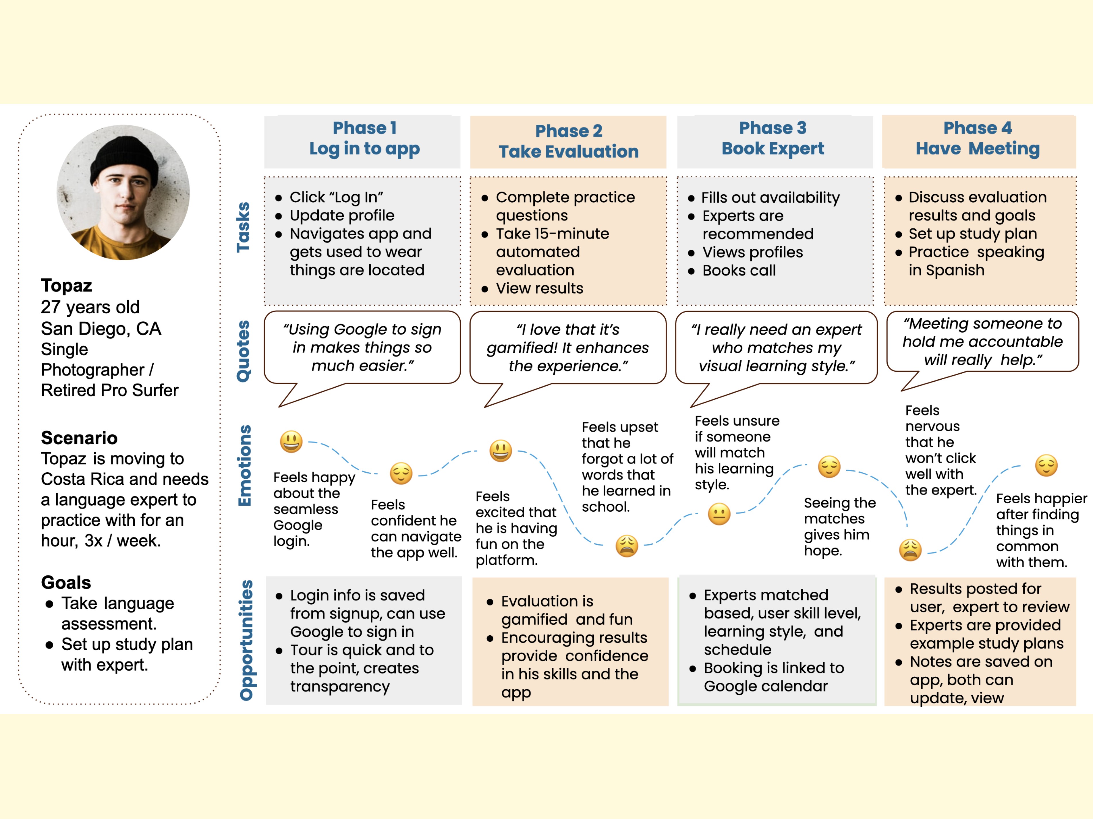
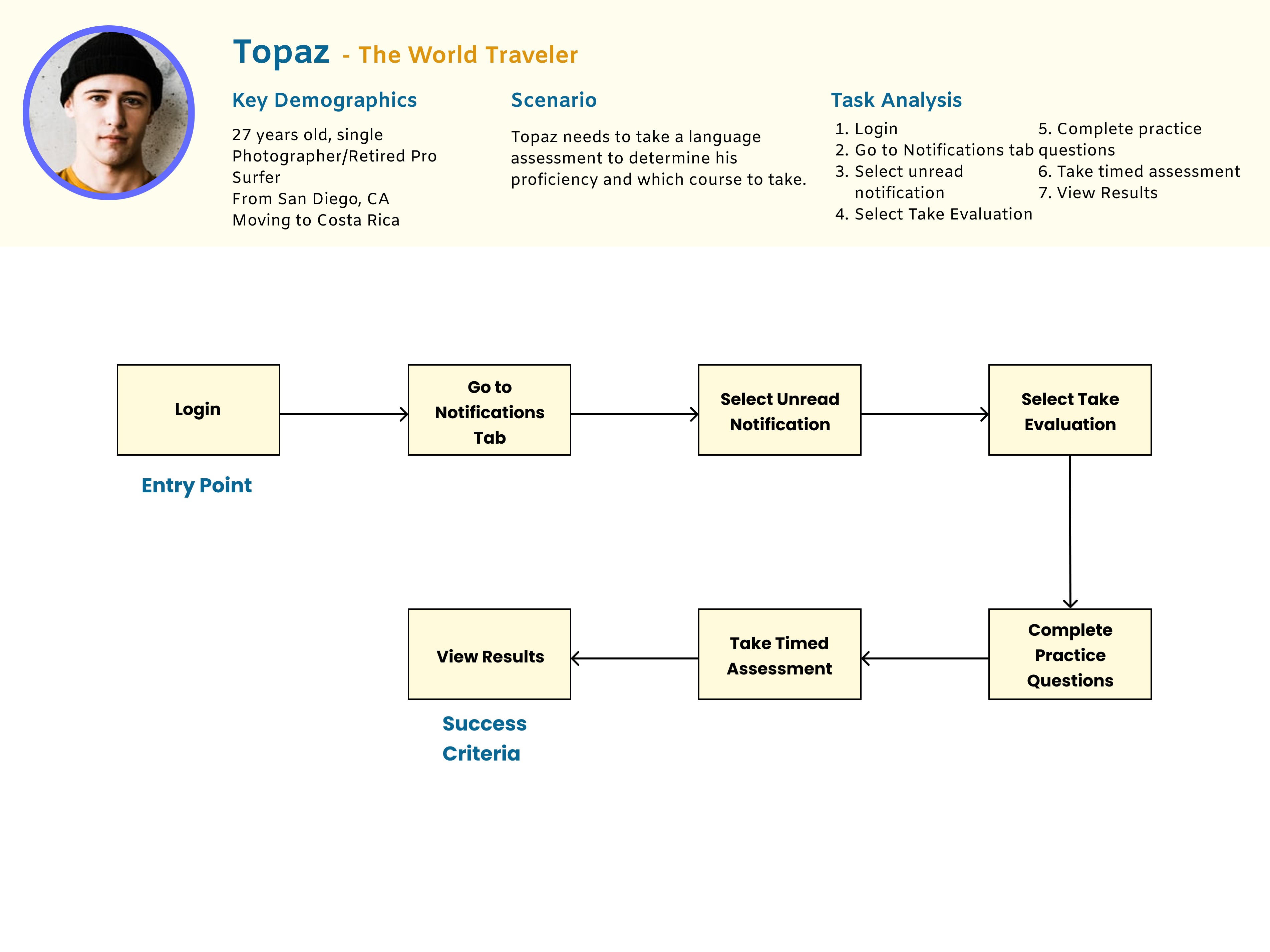
User Personas
After compiling the interview results, I constructed the following personas to serve as the foundation of my design.
Journey Maps
To depict the steps each persona would take to reach his or her goal, I produced user journey maps for each persona.
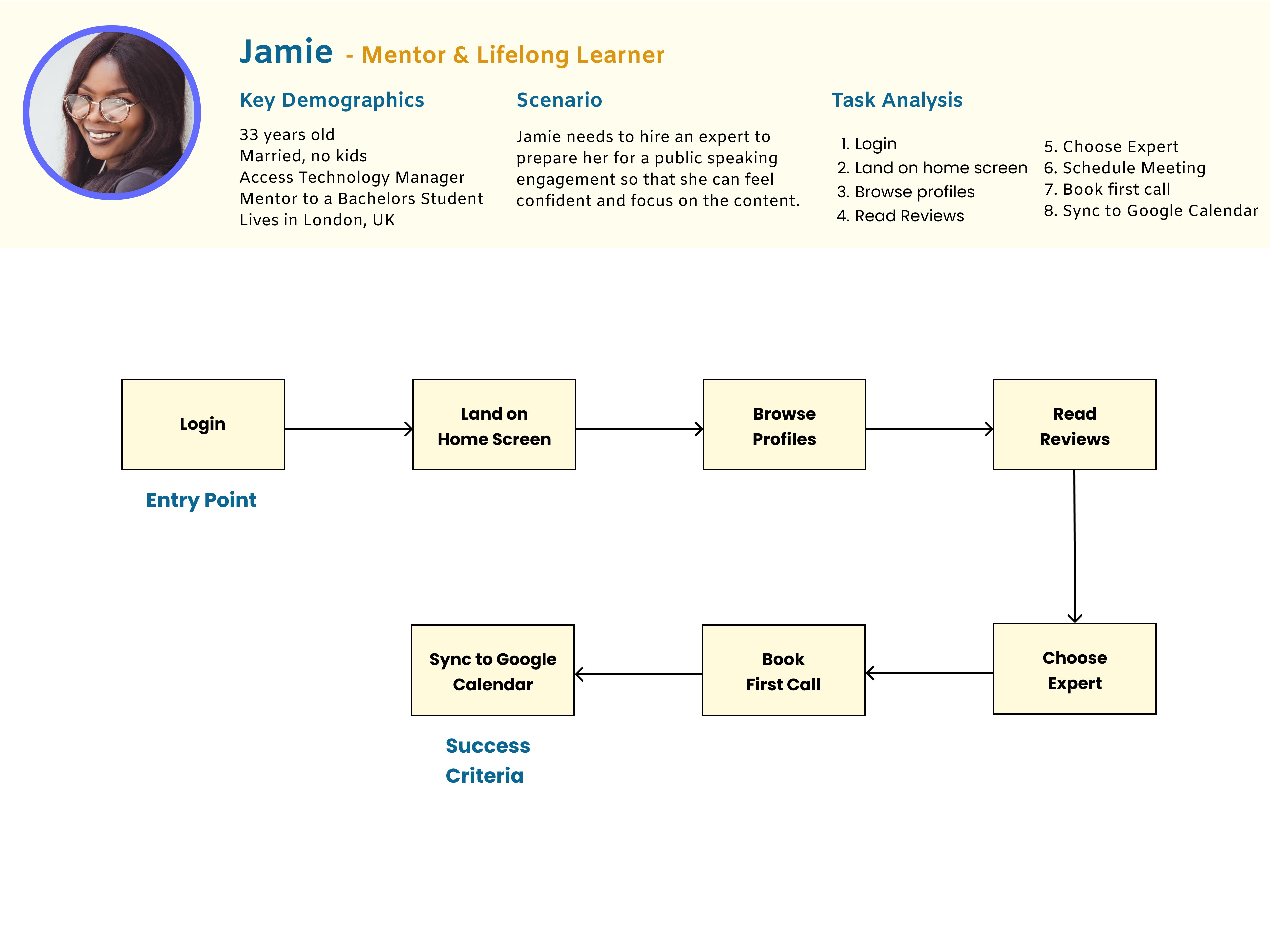
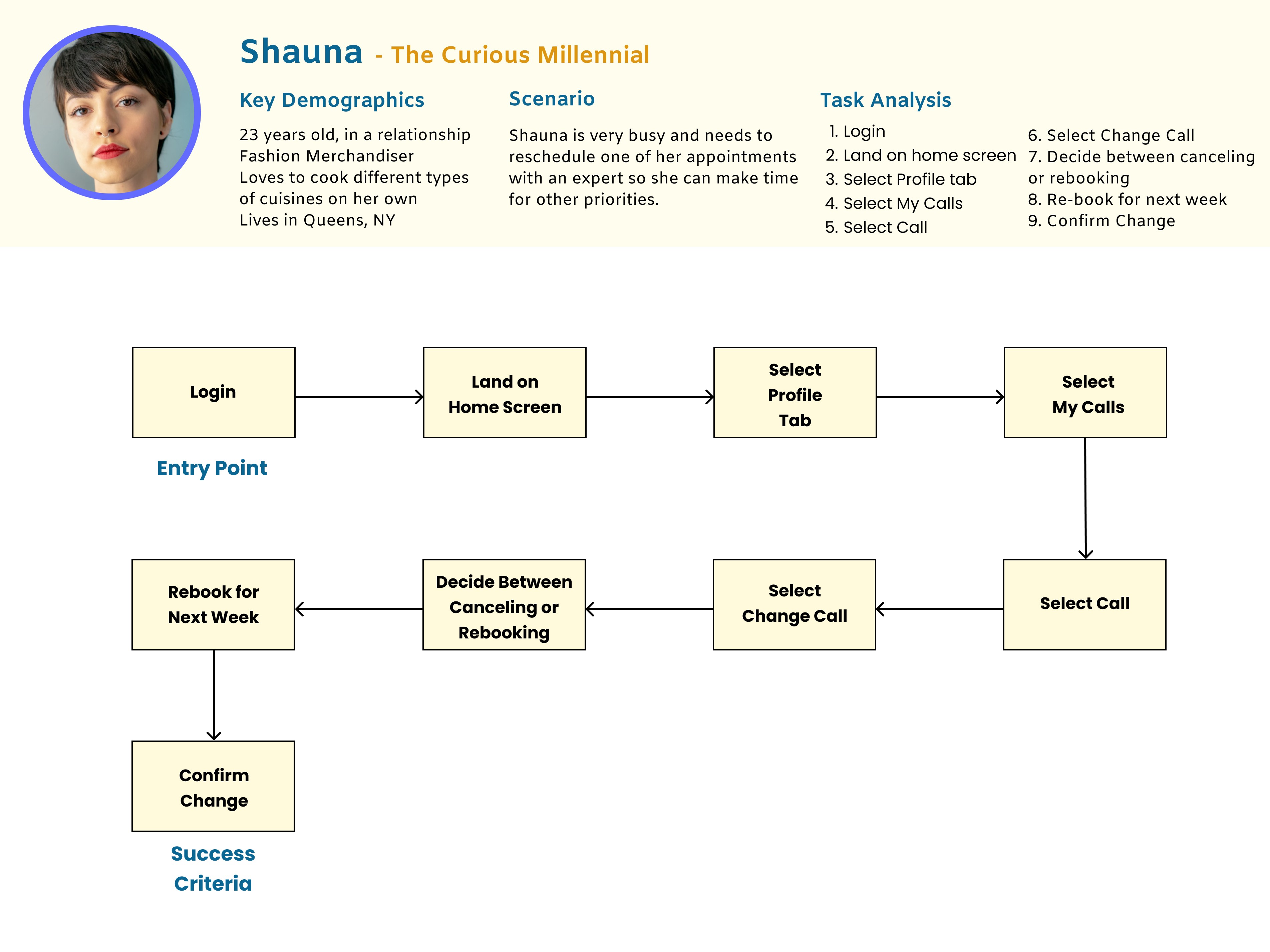
Task Flows
The task flows below outline each precise action a persona may do in an effort to reach his or her goal.
03. Prototyping & User Testing
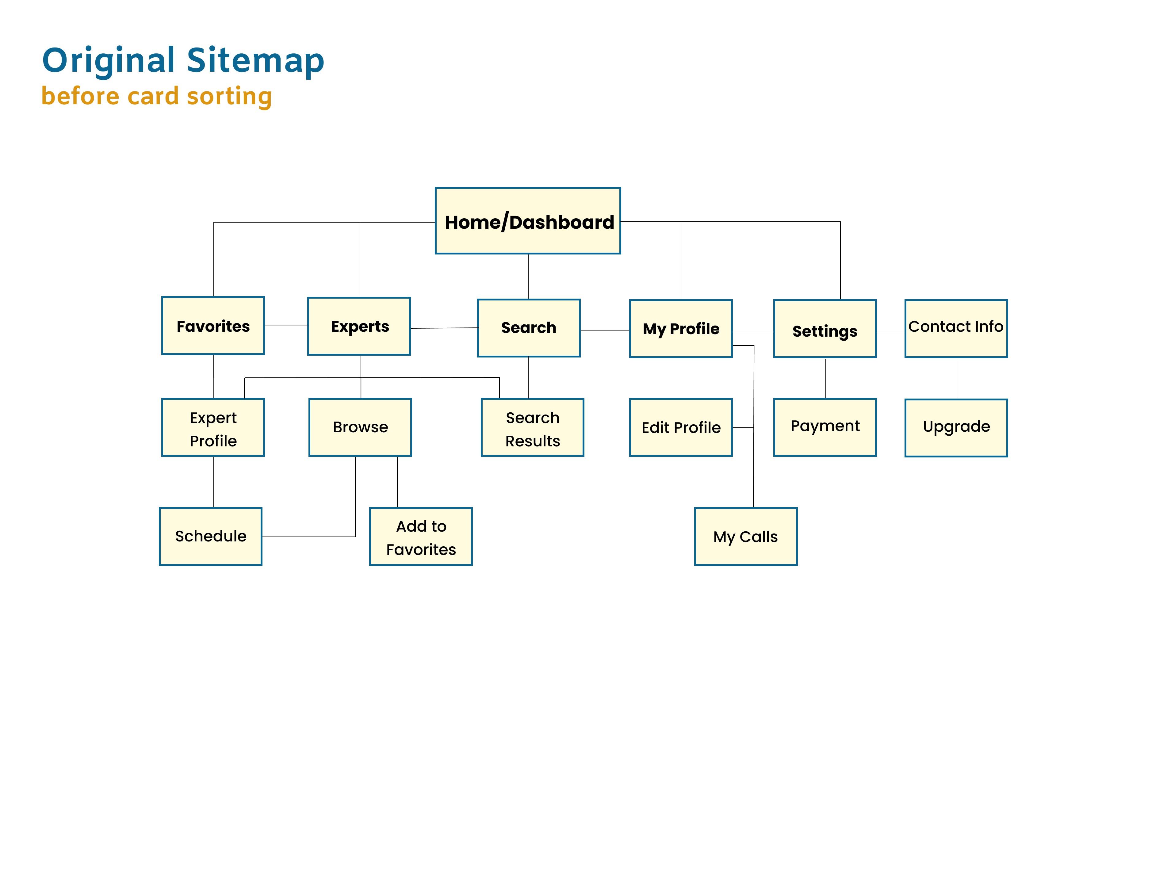
Wireframes
& Prototyping
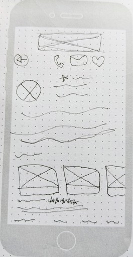
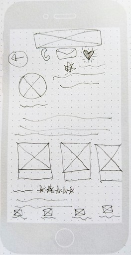
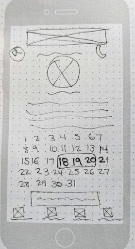
It was time to bring the Masterly prototype to life by starting the iterative cycle of designing and testing. I first used ink and paper to draw out low-fidelity wireframes. I then created mid-fidelity wireframes using Balsamiq. Using Figma and Photoshop, I continued to make adjustments and update the user interface until I had a high-fidelity and interactive prototype that I was ready to test.
Add Expert to Favorites
Book a Call
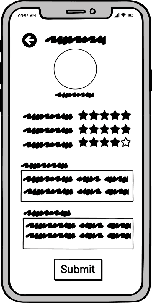
Rate & Review an Expert
Usability Testing
I tested the first prototype with 6 participants between the ages of 25-75. I conducted six remote moderated tests via Zoom.
View Script
Rainbow
Spreadsheet Takeaways
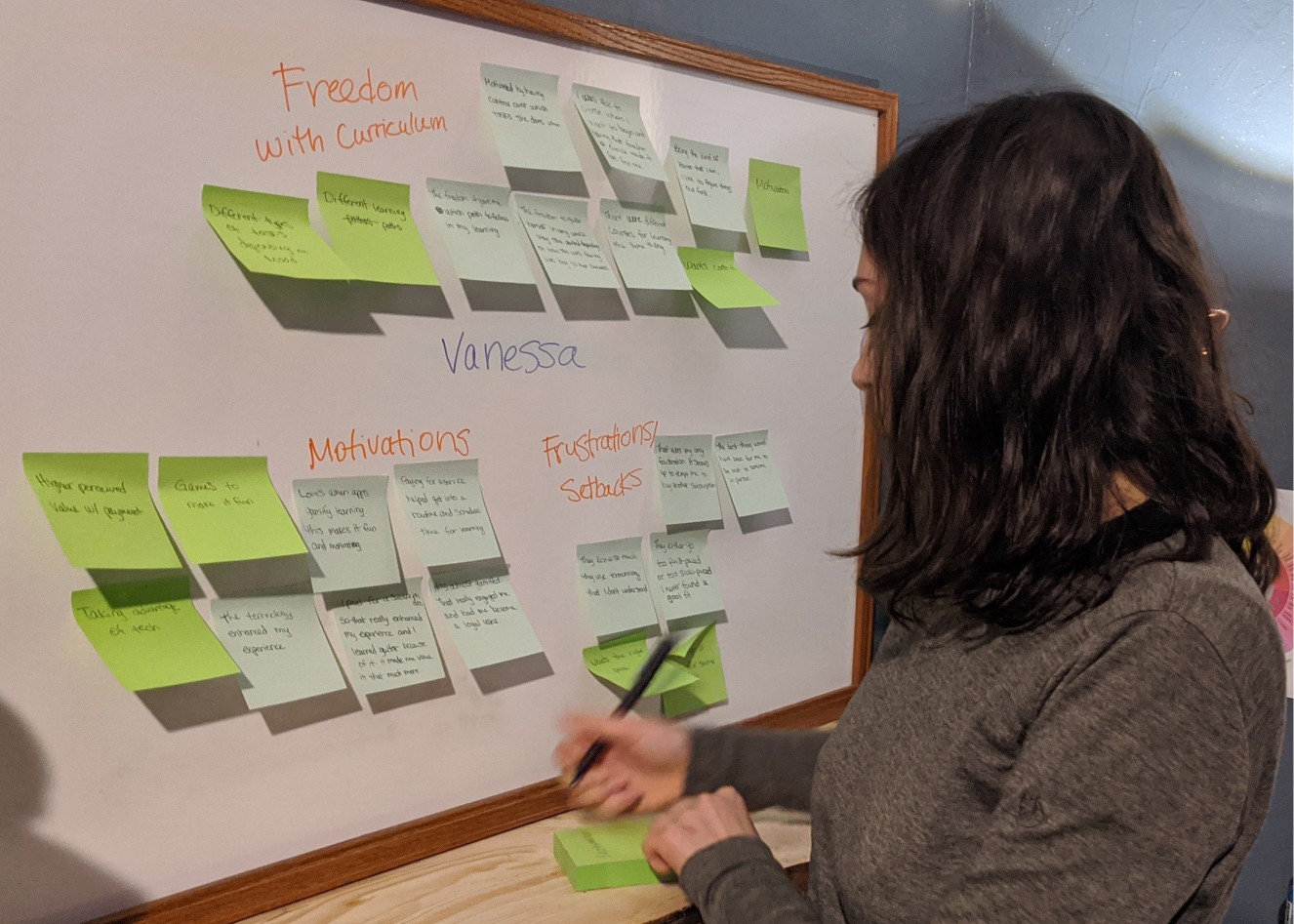
In order to better make sense of the information and to recognize visual patterns, I created a Rainbow Spreadsheet.
View Spreadsheet
Primary Insights
The placement of the buttons and the ability to recognize them are crucial to a happy user experience.
Testing Results
& Changes
After analyzing the test results, I identified five of the most high-priority user errors and frustrations to be fixed in the next iteration.
Issue 1: Book a Call
(Highest Priority)
Booking a call wasn't intuitive.
Suggested Change
Add the words "Book a Call" next to the icon.
Adding a button that enables the user to pull up their own Google calendar to view his or her schedule without needing to leave the app.
To simplify the information down to one screen so they can see everything at once.
Evidence
Four of six participants struggled with this. It's high priority as it's one of the main features of the app.
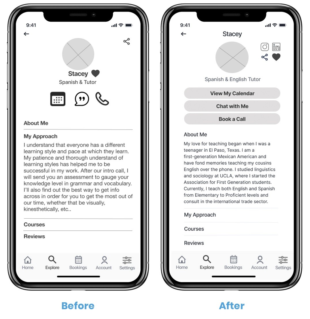
Issue 2: Review an Expert
(High Priority)
The “Leave a Review” button didn't have a border so it didn't look like a button. The review process is multiple steps which confused the users.
Suggested Change
Add a bold border
Implement coachmarks throughout the review process to make for a seamless experience.
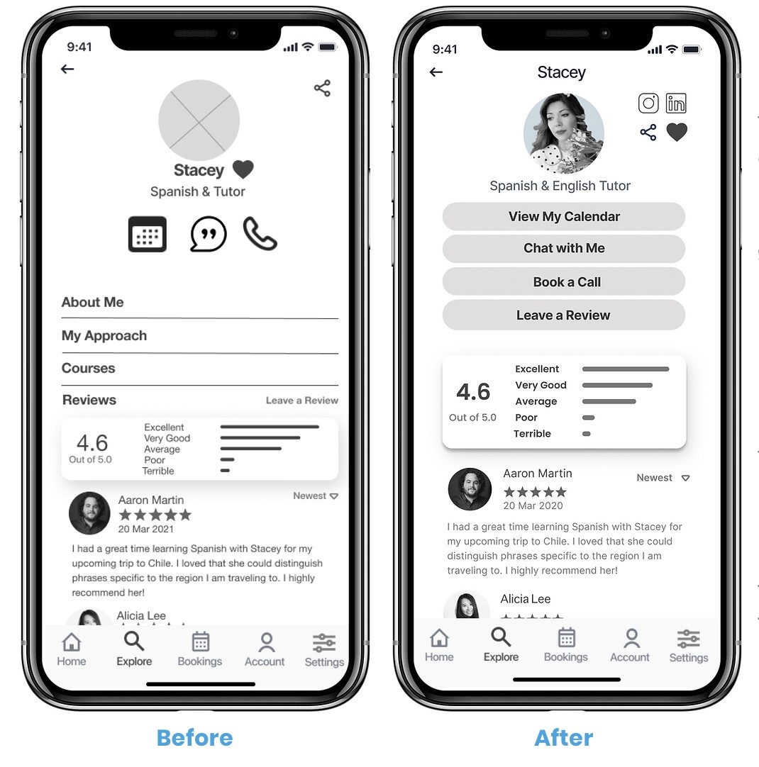
Evidence
The participants had a difficult time figuring out how to leave a review. The participants did not feel like the process guided them like it was meant to. This is high-priority because experts need good reviews in order to get hired by clients and for the app to be trustworthy and reputable.
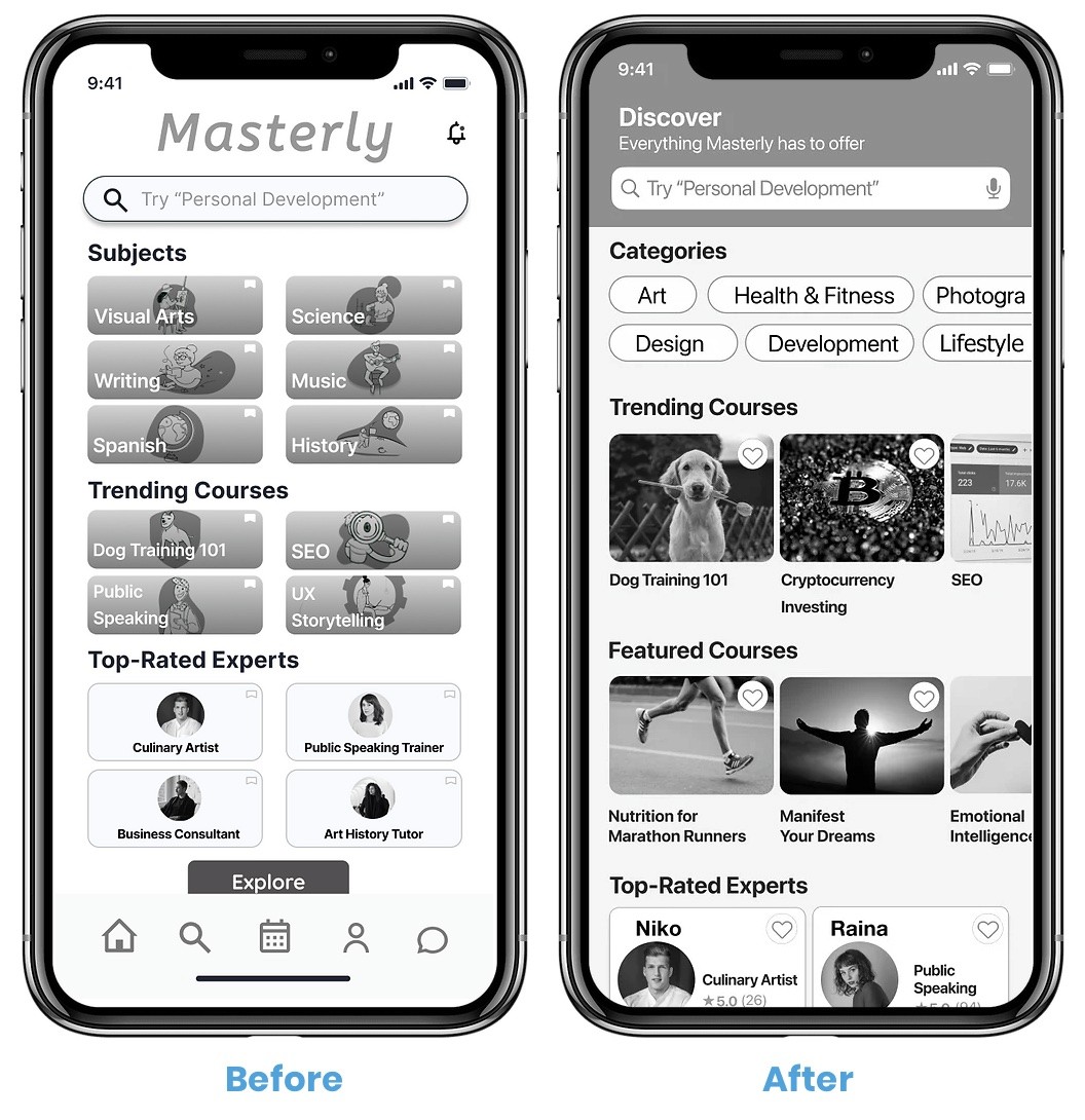
Issue 3: Home Screen
(Medium Priority)
The Home Screen was very visually busy which confused participants.
Suggested Change
Adding bolder headers will help to guide the users’ eyes from one section to the next.
Using photos instead of graphics will help the users connect with the platform as it's more realistic and looks more high-quality.
Evidence
One person’s eyes were going all over the place and she found it hard to focus on a single area at a time. While this issue doesn't affect the core functionalities of the app, it is important to fix because users have a short attention span. We want them to focus on completing tasks instead of being distracted and confused.
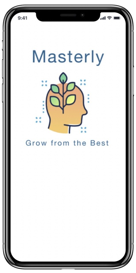
Issue 4: Splash Screen
(Medium Priority)
Some thought it was strictly a cooking-related app. We want people to understand and remember what the app is right away, while maintaining the simplistic design and the idea that nearly anything can be learned through the app.
Suggested Change
Change the splash screen content from a woman cooking to a head with symbolic plant growing. This is the new logo.
Change the tagline to remain
on-brand.
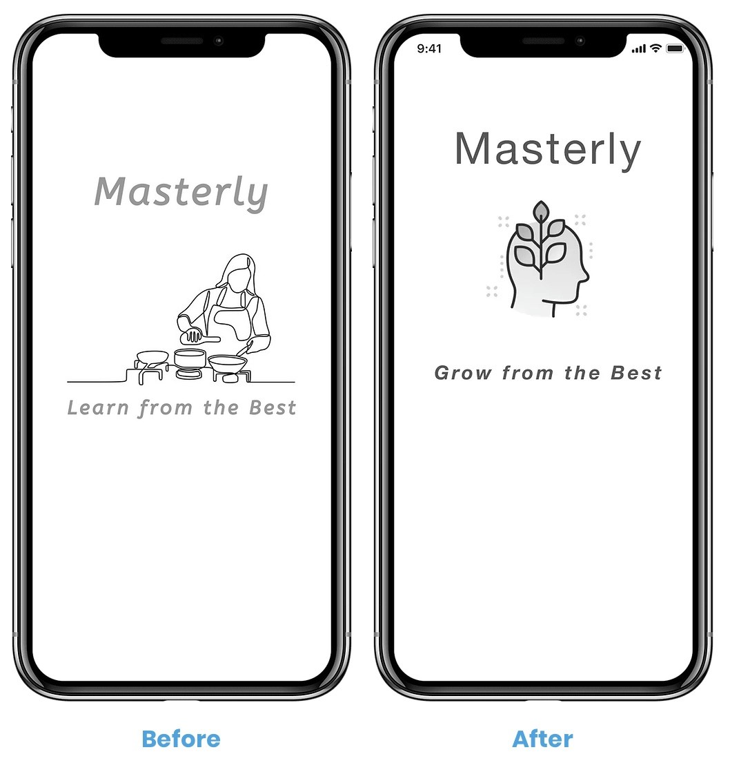
Evidence
Some users were confused as to what exactly the app would entail. This is medium priority as it doesn't affect the functionality of the app, but may deter certain people from downloading it because they don't understand how the app is relevant to them.
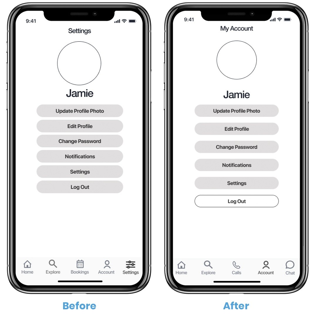
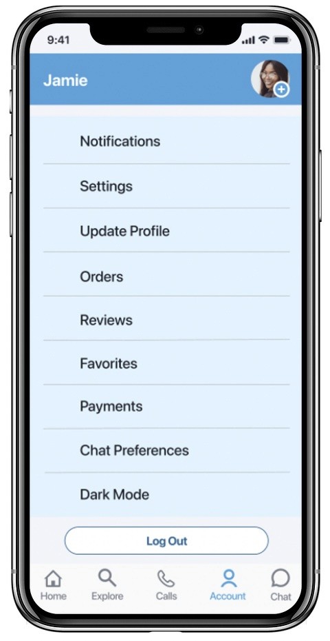
Issue 5: Logging Out
(Medium Priority)
Some looked for the Log Out button under Settings instead of Account. The Log Out button was not immediately noticeable.
Suggested Change
Remove Settings on Navigati
on bar and put everything under My Account.Invert the Log Out button colors so it's distinguishable and so users don't click it by accident.
Evidence
This issue is rated medium because most users did not have a problem with this. The two people that found it difficult had a very hard time and became frustrated, notably our most senior participant. One user suggested that it could be located under My Account because he is used to it being located there on Amazon.
Find a Professional Expert or Tutor
Preference Testing
I recruited 19 men and women ages 20-40 from around the world to participate. I ran the test on Usability Hub over a two-day period.
Goals
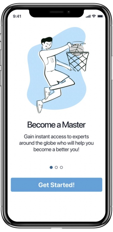
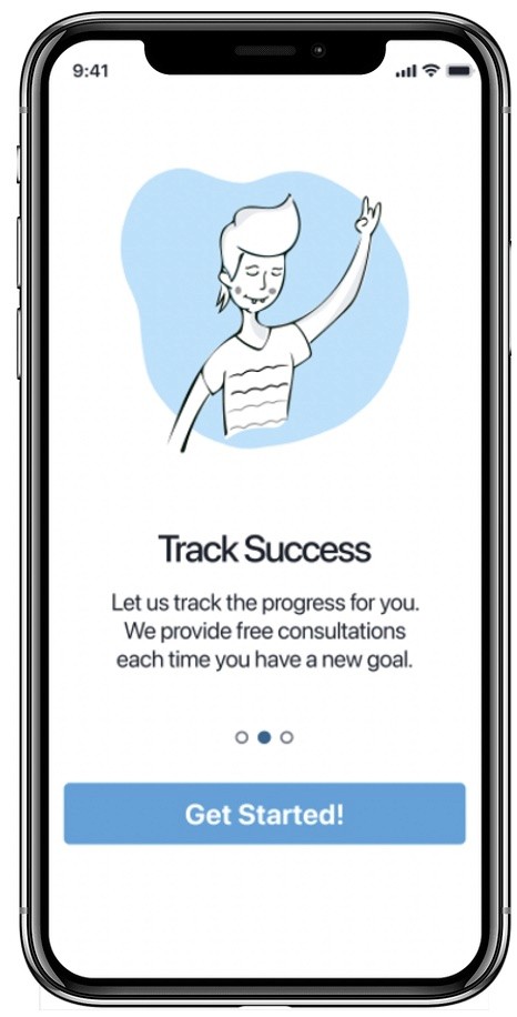
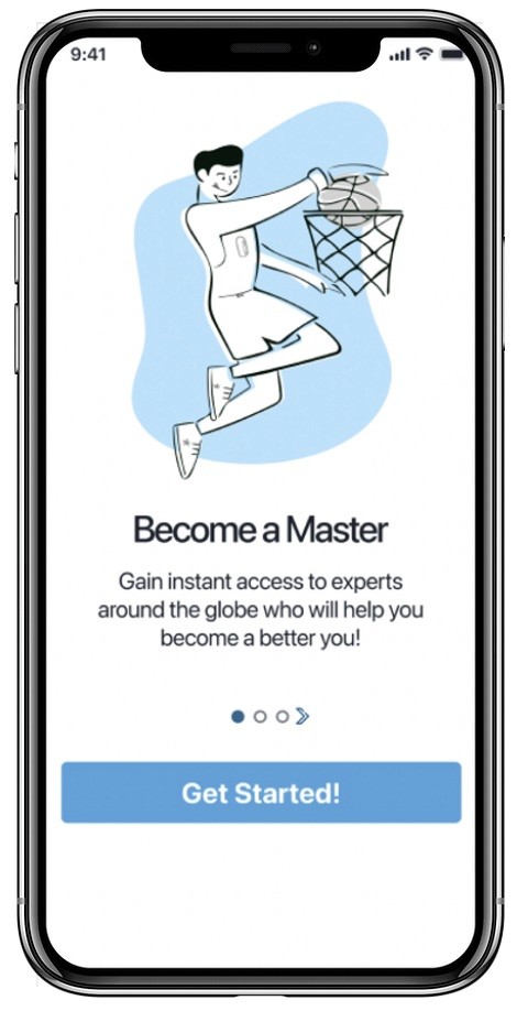
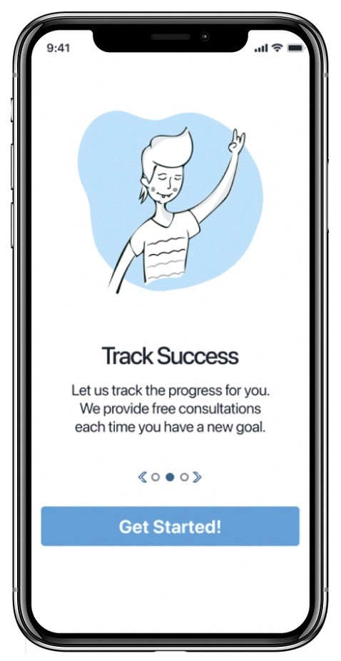
The purpose of this test was to determine which onboarding version of the Masterly app is preferred, specifically which graphics are favored. I also tested which location of the The Next button users preferred, and whether they preferred to have a Skip button or not.
In hindsight, I realize that this should have been three separate tests as it's best to preference test for one feature at a time, like just the graphic for example.
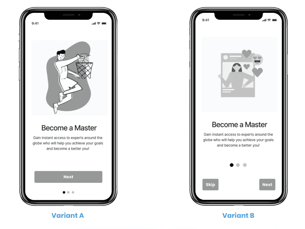
Questions & Results
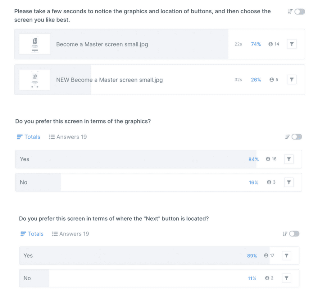
The original design is preferred by most participants. The difference is 99.0% likely to be statistically significant.
I am very confident that the original design is stronger, and that random chance is not coming into play.
While some participants favor the skip button, one user made the strong point that there are only three onboarding screens so it doesn’t really need to skip button.
Preference Testing
Summary
74% of users prefer the style of Variant A.
The results are statistically significant.
Accessibility
After analyzing the test results, I identified five of the most high-priority user errors and frustrations to be fixed in the next iteration.
Guiding Users Through Onboarding
An arrow has been added to the onboarding screens to help people understand there is more information to view if they swipe left or right. This is especially helpful for people who are less tech-savvy or cognitively impaired.
Before
After
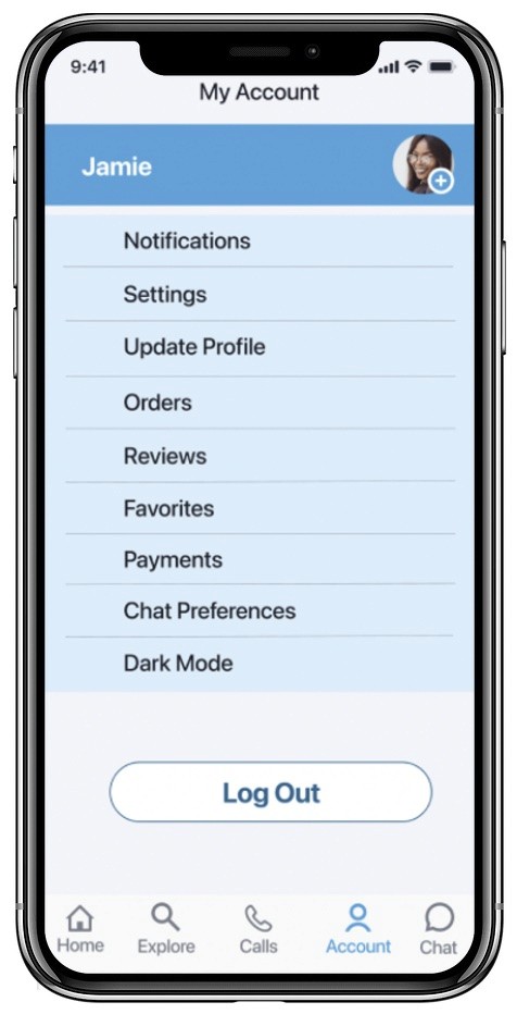
For the My Account screen, the user originally was not reminded of which screen they were on. The header, or page name, has been added. This is especially important for new and infrequent users who might not know their way around the app.
The Log Out button has been enlarged so it’s easier to read and select. The Log Out area is larger and more prominent so it’s easier to notice.
Location & Logging Out
Before
After
Before
After
Before
After
Before
After
Before
After
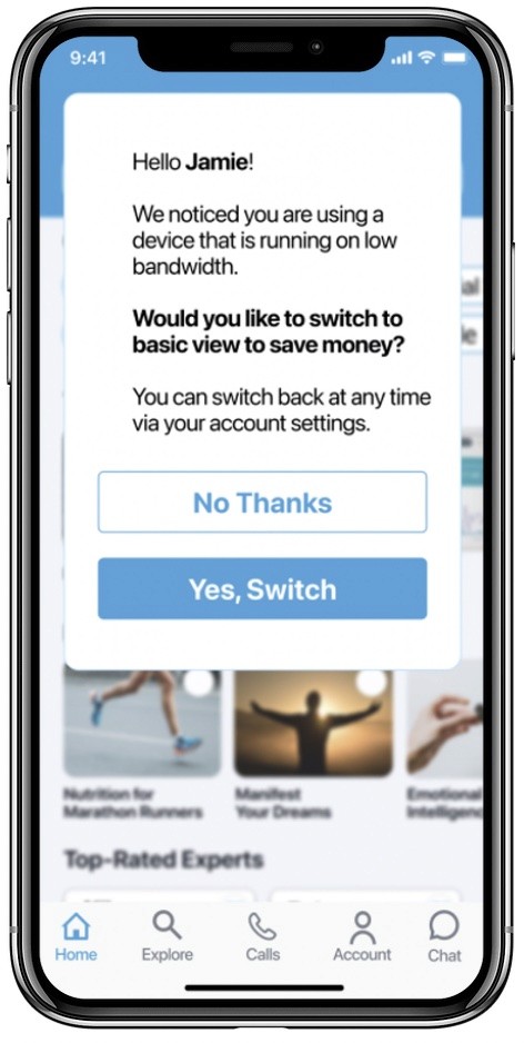
A pop up has been added to the Home Screen that asks the user if they would like to switch to a basic version of the app. This is helpful for people using older technology, or who are in areas like rural Africa where the bandwidth connection is very slow, causing pages and images to load much more slowly.
The basic version will help pages to load more quickly. It will also be less costly to use if the users don’t have an unlimited data plan.
Old Bandwidth & Outdated Technology
Before
After
Before
After
Before
After
Before
After
New Feature
Before
After
The font sizes for the splash screen, expert profiles, and navigation bar have been increased so they are more legible for people who are older or visually impaired.
Enlarging Fonts
New Hypothesis
My new hypothesis is that a seamless design doesn’t make the user think twice about what they should do next. It should adapt to the users’ needs and behaviors and feel natural to them. If the user has a hard time figuring out what to do, they are most likely going to get frustrated and exit the app. Feedback from testing has revealed whether this to be true or not and whether we are on the right track.
Hypothesis Validation
To validate the new hypothesis, I will continue to open up my prototype for feedback and continue to conduct preference and usability testing as necessary.
Areas of Improvement
The feedback given suggested I should develop the review & rating area more, which I will do on my next iteration.
User Testing Involvement
User testing will be monitored either remotely or in-person. I will have a clearer idea of what to focus on as testing grows and ideally test the app in real world environments to see what can be improved upon.
Timeline for Improvement & Implementation
I will continue to improve the app on a regular basis until it has reached a state of maturity that doesn't require as many frequent updates.
Next Steps
UX Design Work Samples
I've curated a gallery of my latest Product Design case studies to showcase my workflow.
Product Design
Masterly: An iOS app providing the opportunity to hire an expert or tutor in an instant to learn any subject
UI Design
MintFI/RE: A responsive web app bridging finance, its community, and education
UX Research
Skyscanner: Implementing hyper-personilized experiences to improve the conversion rate
Lauren Demi Chagaris
Thanks!
Thanks for taking the time to view my portfolio. Feedback is welcomed and greatly appreciated.
Let's inspire each other & build something.
laurendemi.design@gmail.com